Tag Archive for: website

How and Why to Use Sliding Pop-ups

Email lists are a key part of online marketing for financial advisors—and for me, too. I was intrigued when advisor Dave Grant told me on Facebook that he was using a sliding pop-up with a chat function to get more mileage out of his website. His guest post below resulted from our discussion.

How and Why to Use Sliding Pop-ups

By Dave Grant

One problem advisors have is building a credible email list in order to share their thoughts with a list of prospects to ultimately gain new business. The old way was meeting someone and then asking to add them to your mailing list. But in the age of more interaction online, you need a way to capture visitor information of those whom you may never meet in person. This is where pop-ups come in.

By offering a newsletter / free report / video series for visitors to your website, you can obtain their names and email addresses to add them to your list and, potentially, a drip marketing campaign. However, static opt-in boxes are often ignored, so how do you get that valuable information?

It may be time to use a pop-up. Pop-ups on websites can be annoying, but they have been proven by multiple marketing studies to increase visitor engagement through newsletter opt-ins because they are dynamic on the page. Instead of a pop-up in the middle of the screen, there is now an alternative that’s less annoying but still effective: the sliding pop-up.

Usually situated in the bottom left- or right-hand corner of a website, this box can transition in after a set period of time or when someone hits the end of the page, making readers notice the opt-in box. However, it’s not annoying like a traditional pop-up that blocks the reader’s view of the screen. When you use your company’s branding on these opt-in forms, they look like an extension of your site rather than a standard opt-in form. Many advisors find pop-ups increase their newsletter opt-in rates.

I’ve taken the pop-up one step further by adding a chat program.

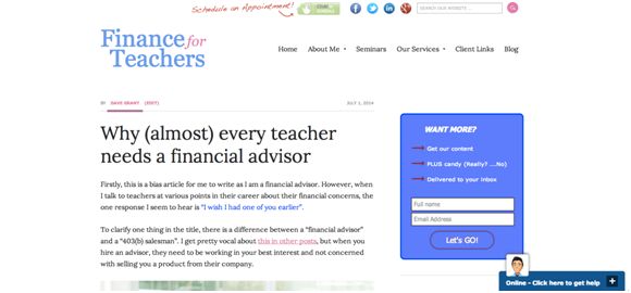
While I still have static opt-in forms on throughout my site, I use the sliding pop-up on the bottom of my screen with a chat program. When people get to the end of an article, or after a set time period, the chat box slides up and I introduce myself with template text. From there, people can ask questions and interact with me in real time. Look at the image to see a screenshot of the initial view of my pop-up. Notice “Click here to get help” in the lower right-hand corner? That’s where you can start to chat with me.

finance for teachers

I’ve seen my conversations, not just opt-ins, with potential clients increase dramatically using this method. Now my website averages one good prospect conversation per week instead of the one per month I gained from the “Schedule an Appointment” button on my website.

If you’re wondering how to implement this strategy, there are many sliding pop-up options for advisors who use WordPress. You can download them as a plugin and adjust the wording yourself. To add your firm’s branding may require a web designer to write some code. Some options include AppSumo List Builder, Bounce Exchange, and OptIn Monster. There are also free options.

For my chat pop-up, I use ClickDesk. I like that it sends a chat transcript to my email once the chat closes.

____________

Dave Grant, CFP(R) is the founder of Finance of Teachers, a fee-only financial planning firm in Cary, IL, serving teachers, primarily in Illinois. He is also a columnist for Financial Planning magazine, writing about issues facing Gen Y advisors. His recent book “The First Year” discusses the challenges of the first year of running his RIA, tips on how to be successful, and is available on Amazon KindleiBook, and through The Mercato.

Reader challenge: What makes advisor websites outstanding?

What do YOU think makes for an outstanding advisor website? Please share your thoughts below.

Advisor-recommended websites to spark discussion

I recently asked my readers for examples of outstanding money manager websites. Below you’ll find screen shots with links to the home pages for their recommendations. Plus, I’ve linked to the sites of the two people who made recommendations.

Tell me what you like about these sites. Do they do things you’d like more advisors to do?

To facilitate discussion I’ve numbered the websites, which are listed in alphabetical order. I’ve also shared at least one of my impressions of the site. But my comments are not comprehensive.

1. Capri Capital Partners

Nice clean look. Good tag line.


2. Index Strategy Advisors

I love the goldfish photo.


3. Oak Park Financial Planner

This website speaks to “you,” the potential client. Too few advisor websites do this. It also has a newsletter subscription box displayed prominently “above the fold,” which means the reader doesn’t have to scroll down to see it.


4. oXYGen Financial

The home page offers plenty of opportunities to click to become more engaged with the website or the firm.


5. Pinnacle Advisory Group

The featured content on the home page is always changing, giving the reader a reason to return. The uncluttered home page features a striking image.


6. United Capital

The home page features a striking photograph along with video and print content to engage readers no matter how they prefer to consume content.


7. Wealthcare for Women

This website uses plain English. You feel that there’s a real person behind it.

What do YOU think?

I look forward to hearing from you.

Q&A: How to look trustworthy in your professional photo

Convincing clients and prospects to trust you is essential to building relationships with them. A great photo alone

Lori Johnson

won’t win them over, but a bad photo can undermine how they see you. This is why I conducted an email interview with Lori Johnson of Your Best Image. By the way, Lori specializes in photographic image and she did the makeup for my head shot photo.

Q. What about a photo makes you appear less trustworthy?

A. Dark shadows in the face or background.  Anything that hides the face i.e. sunglasses, hat, facial hair, hairstyle that covers the face, etc.  Poor quality photos.  Inappropriate wardrobe, makeup, hairstyle.  Too much photo shop alteration of the photo so you do not look like you do in real life.

Q. What conveys “trustworthy” in a photo?

A. A sincere smile and sparkle in the eye. Clothing appropriate for the industry and your personal style.  Colors that flatter your skin tone, hair color, and eye color.  Use an open stance; no tightly crossed arms or hands in front of your body, open and relax shoulders, and stand or sit tall.

Q. I’ve heard that blue is the color of trust. Do you agree?

A. Yes. Darker, deeper blues such as deep navy blue are serious and powerful. Deep blue sends a message of authority and credibility, which is why it’s commonly used in formal business attire and as a uniform color. In fact, navy blue gets its name because it’s been the color (along with bright white) of the British Royal Navy’s uniforms since 1748.

Q. Do casual photos make a financial advisor seem more approachable?

A. A few casual photos can help tell your story and make you appear more “real,” open, and friendly. Use these photos to help personalize your print, web, social media, or other marketing materials. They should not be the main images in your materials.

Be careful about the quality and quantity of your casual and personal photos. Poor quality photos may make you appear less professional. That’s why I recommend you rely on a professional.

Q. Can you recommend how to prepare for a professional photo shoot?

A. You’ll find detailed recommendations in my article, “Pre-shoot Suggestions.”