Financial e-newsletters, kill your annoying, weak clickbait!
Some financial e-newsletters drive me crazy. I click to open them and find nothing there. Well, not nothing, but just enough to annoy the heck out of me.
If you’re doing what these newsletters do, please stop.
The most annoying habit of financial e-newsletters that I actually open
If I actually open a financial e-newsletter, I expect it to have some content. The body of the newsletter shouldn’t simply consists of links leading elsewhere.
Below is an example of a newsletter that failed the test. The first two blacked-out lines are the title of a blog post formatted as a clickable link. I’m concealing the firm’s identity because I assume this is an innocent mistake on their part. It’s the kind of thing that happens when non-professional writers create content.
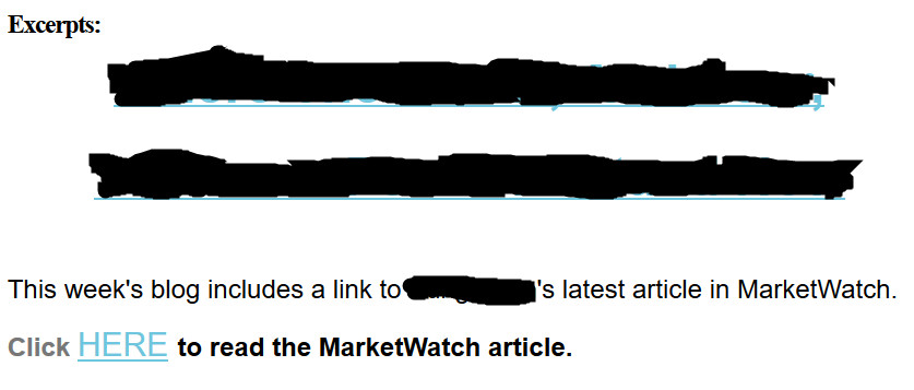
This is the only text that appeared in the main body of a financial e-newsletter that I received.
I think that the e-newsletter senders hoped that their links would serve as clickbait—provocative content that drives readers to a web page. However, the title of a blog post written by financial professional rarely has the flair to do that.
The senders could have achieved better results by adding a brief summary or introduction to their article on MarketWatch. That would have let me assess whether their topic interested me.
I understand that the authors probably are limited in how much they can copy from their MarketWatch article. However, that shouldn’t prevent them from writing teaser copy or saying “If you’re a ___ type of investor, this article can help you to ____.”
The second offense by this financial e-newsletter
 When I clicked on the two blacked-out lines, which are clearly meant to be clickable links, they took me to a post on the company’s blog. The content on the page? Exactly what you see in the image above.
Oops! I had to click again to reach the article on MarketWatch. What casual reader is going to take all of these steps with so little indication in the e-newsletter of what benefit they’ll gain from their clicks?
I understand that people want to drive traffic to their websites. But balance that against the risk that along the way you’ll annoy and lose readers for your financial e-newsletters.
I think the newsletter senders in this case should have linked directly to their post on MarketWatch. They would have avoided annoying me by sending me to their blog post that didn’t add anything new. Also, even without the link to their website, they would have learned whether their title was strong enough to interest me. Most newsletter programs allow you to measure your readers’ click. Although their measurements aren’t 100 percent accurate, they’ll tell you if one title attracts more readers than another.
Mistakes by other financial e-newsletters
What else do financial e-newsletters do to annoy or drive away readers? They:
- Add people to their newsletter distribution lists without asking permission, as I’ve discussed in “no, No, NO: My business card shouldn’t add me to your e-newsletter list” and “Our LinkedIn connection isn’t an invitation to spam.”
- Use weak subject lines in their emails. For an analysis of a weak title and how to spice it up, read “Stop! Get a better title, or forget winning readers.”
- Send newsletters that aren’t mobile-friendly. Today people are often read emails on their phones and other mobile devices that fail to display traditional e-newsletter formats effectively. For tips on how to be mobile-friendly, see “3 ways to make your emails mobile-friendly.”
They may also suffer from “4 reasons your emails don’t get results.”
Image courtesy of adamr/FreeDigitalPhotos.net

