Use Trello to manage your VA’s marketing help
If you’re a solopreneur like me, you may hire a virtual assistant (VA) to help with routine tasks like marketing. As your VA’s tasks multiply, the two of you may have trouble tracking them. You may find yourself searching for an email trail or wondering if you’ve told your VA about a specific task. That’s why I started using Trello, an online collaboration or project management tool. Here are my tips for using Trello to manage your VA’s marketing help.
Ask your VA what tool they use
When you hire a VA, ask how they track their projects. If you’re using the same tool—say, Trello instead of Asana, another popular tool—your communications will flow more smoothly because of greater integration.
However, different tools don’t pose an insurmountable obstacle. I use Trello, while my VA uses Asana with many of her clients. I think she has to import my tasks into Asana.
Set up boards that reflect your process
Boards are columns that contain cards that represent individual tasks. While Trello says that “a board represents a project,” I think of each board as a category of tasks.
My key boards are “TO DO,” “IN PROCESS,” and “WAITING for Susan’s input,” as you’ll see in the image below.
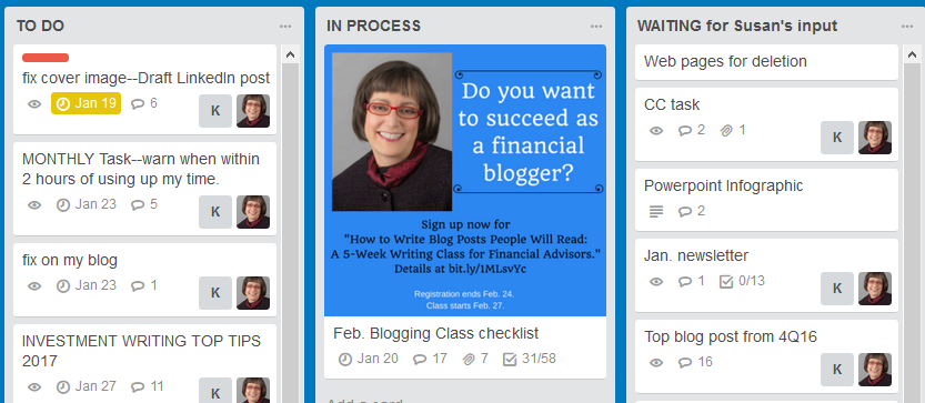 Each board consists of multiple cards. Each card represents a task, such as “fix cover image–Draft LinkedIn post” in the upper left of the image. As you and your VA make progress on a task, drag it from one board to another.
A card keeps in one place all of the information related to a specific task. It cuts down on the number of emails you send and receive because all conversations about the task appear on the card.
Cards typically move from TO DO to WAITING. They may repeat the cycle by returning from WAITING to TO DO (or maybe IN PROCESS) before hitting DONE, a fourth board that is like a graveyard for completed tasks.
Pick deadlines wisely
Learn your VA’s approach to deadlines, and take it into account when setting deadlines and organizing tasks.
For example, your VA may wait until the deadline day to read about and start the tasks due that day. This causes problems if you have a big project due all at once. It also hurts if a small project is due on a busy day for your VA. If you have a huge project, you should break it down into small steps and make the first step’s deadline early. This helps VAs to pace themselves.
Breaking down tasks and scheduling them at appropriate intervals is probably a good approach for working with any VA. Time is money. The less time your VA spends assessing your schedule, the more time they can spend helping you with your marketing. Also, the typical VA balances multiple clients. I imagine that it’s hard for them to keep multiple projects straight in their heads.
Use checklists for multi-step tasks
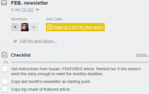
A Trello checklist can help your VA track all of the necessary steps in completing your marketing tasks. For example, here’s the start of my monthly newsletter checklist.
 In the beginning, I created one checklist per card, as with my monthly newsletter. More recently, I’ve created Trello cards that consist of multiple checklists. For example, my blogging class card includes 16 checklists organized in chronological order. It starts with a checklist called “13 weeks before class starts [week of 11/21]” and ends with “week after class ends [week of 4/3].”
Trello lets you copy checklists. After we complete one set of blogging class checklists, my VA will rename and re-date the checklists for the next class.
These reusable checklists have made my life much easier. I think they also make it easier for my VA to manage my gazillion small tasks.
Use Trello to track “use it or lose it” hours
Many VAs let you prepay for a discounted package of hours. However, they may not let you roll over unused hours into the next month. Or, they may limit the number of hours that you can roll over. On the other hand, if you need more hours than what you’ve prepaid for, you’ll pay a higher rate.
I have two monthly Trello cards to help me track my VA’s hours. A mid-month task asks her to tell me how many hours I’ve used. A late-month card asks her to tell me if I’m within two hours of using up my monthly allotment.
Archive or delete completed Trello cards
To keep Trello useful for a quick overview of pending tasks, you should move completed cards out of sight. This could mean moving to a DONE column.
Alternatively, you can archive cards, which would allow you to search and find them later. Note: your VA won’t be able to view cards that you’ve archived.
Deleting cards is the next step beyond archiving. If you delete cards, they’re gone forever.
Free vs. paid version of Trello?
I use the free version of Trello. When I had a temporary free upgrade to Trello Gold, I didn’t use it. However, if you have a technologically more complicated business than I do—or if you have a larger team—you may find a paid version of Trello helpful.
Bonus tip
Don’t make the mistake that I sometimes make. Don’t forget to hit “Send” after you create a new card or comment in Trello. If you don’t hit “Send,” your VA will never see your task or comment.
Also, you can read my tips on “9 Ways A Virtual Assistant Can Streamline Your Financial Advisor Blogging” on the Nerd’s Eye View blog published by Michael Kitces.

 What is your process for bringing on and helping new clients? Does it aim to fit clients into a standard set of products, or are offerings tailored to the clients after you learn about their needs?


 You can edit better when you know the purpose of your work. At one extreme, are you merely proofreading for big errors so you’re not embarrassed by someone’s title being spelled as “manger” instead of “manager” or are you looking to change the tone and content of your bios?