MAY NEWSLETTER: AI prompts for content marketing
AI prompts for content marketers The use of artificial intelligence (AI) in content marketing is increasing. I’m not a big fan of AI, but I realize that it can be useful. If you’d like to experiment with AI in your content marketing, check out Andy Crestodina’s “The Prompt Library Starter Kit,” recommended by my fabulous […]
MISTAKE MONDAY for April 28: Can YOU spot what’s wrong?
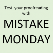
Can you spot what’s wrong in the image below? Please post your answer as a comment. Once again, here’s an error in a major newspaper. I suspect that text, such as headlines and captions, that isn’t written by the reporter may be particularly prone to […]
5 steps for rewriting your investment commentary
Investment commentary authors often know the markets well, but lack writing and editing expertise. After all, they’re earning big bucks to manage money, not to write. I’ve learned some lessons about how to edit investment commentary that I share below with you. The lessons are based on my years of experience editing and writing commentary […]
APRIL NEWSLETTER: Help for identifying best practices
Everyone wants to use best practices. But how do you identify the best practices for your situation? Tom Brakke of The Investment Ecosystem blog shares a simple exercise that you can do. In “Common Practices, Best Practices, and Next Practices,” he suggests that you ask, “How would you describe what you do in comparison to the standards […]
MISTAKE MONDAY for March 31: Can YOU spot what’s wrong?
Can you spot what’s wrong in the Mistake Monday image below? Please post your answer as a comment. I post these challenges to raise awareness of the importance of proofreading. There’s more than one way to rewrite this week’s example. What’s your suggestion?